NEONATAL INTENSIVE CARE UNIT

HOSPITAL NICU

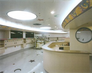
This design was created for Clear Lake Regional Medical Center by Caren Burns a licensed architect located in Houston, Texas. A Neonatal Intensive Care Unit, it was designed with the baby in its mother’s arms as the concept of the design focus. It was groundbreaking concepts like this that changed the way that NICU care was delivered at this hospital. This design emphasizes the point around which the two distinct needs of women and children revolve. These babies are born to soon to be taken home, sometimes for months. Creating a sterile environment with creative elements was inspired by the existing shape of the hospital. The building was constructed with a circle as a floor plan. That created the genesis of the circles used and inspired the setting for the galactic scenery. The birth of a child is as miraculous as the birth of the universe. Both ideas seemed a good fit for a design/program vocabulary. Indirect cove lighting was mostly used but if necessary, individual lights over each incubator could be turned on or off. The required medical devices were carefully placed on a custom designed headwall for each incubator. A centralized nurse station allowed for easy viewing to all stations as well as the special isolation room located next to the nurse station with a view through a round window. So inspired were the construction crew, as the design came together, that the subcontractors took special care in assisting and painting the stars, planets and moons on both the ceiling and their placement on the welded seam floor. The parents of the children were put at ease by the non-threatening setting of what is a very serious but functional environment. Attention was placed on every detail. Even the air supply grilles were painted different colors to add to the quality of the design solution. Nature in design is not limited to forest and trees.

Posted in HEALTHCARE PROJECTS | Leave a comment

CHILDREN’S EXAM ROOMS

CHILDREN’S CLINIC

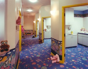
From the custom designed flooring to the placement of child friendly graphics, the colors and materials were chosen to make a visit to the doctor a fun and pleasant experience. One of the most rewarding experiences about this project was when the door opened and a very young girl just said nothing more than just “WOW!” Appealing shapes and colors can provide a child with a sense of familiarity. The process of a design idea, taking form and converting it to function is rewarding, most importantly because the solution is all about the end user and their needs. The primary purpose of all the design elements from the quality of lighting to the choices of colors and textures are to strive to make a real difference to patients and staff. Microbe safe carpet, easy to clean surfaces, illuminates how operations, performance, and the bottom line are improved through good design.

Posted in HEALTHCARE PROJECTS | Leave a comment

PEDIATRIC & WOMAN’S CLINIC LOBBY

CHILDREN’S WAITING ROOM

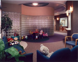
Medical problems of children treated by the pediatric specialists at women & children’s clinics are often quite different from those commonly seen by practitioners at other facilities. Pediatric specialists typically request design solutions that use equipment, techniques and facilities specifically designed for children. This physician’s clinic was designed to serve both women’s and children’s needs. The two lobbies were divided by a glass block, serpentine designed wall. A common but divided nurse station served both areas. The waiting areas were arranged and decorated with both women and children in mind. This included examination rooms and waiting areas, which had toys, videos and books for children, all of which help create a comfortable and non-threatening environment for the young patients. A comfortable, safe and inspiring setting eased the tension of the family’s visit to this health facility. Lighting has a direct effect on patient wellness. This design solution was planned with natural and other types of lighting fixtures in lieu of overhead fluorescent light fixtures. This type lighting was chosen in order to replace the strobe effect generally given off by fluorescent light fixtures, which can often disturb children and or adults with illnesses. The colors and shape of the space were all designed to create an economical but serene environment while dividing the two types of patients. The children’s exam rooms further utilized child friendly design.

Posted in HEALTHCARE PROJECTS | Leave a comment

HOSPITAL NURSE STATION

HOSPITAL NURSE STATION

 Rosewood Medical Center was a 231 bed facility located in Houston, Texas. This nurse station was designed to upgrade the image of a tired facility. Interesting lighting and curved lines worked to improve circulation at an “L” intersection. Nurse stations serve an important service to both the staff and to the public. Hospital’s took on their modern meaning as “an institution where sick or injured are given medical or surgical care” in the 16th century. All of the materials were chosen for low maintenance with high style. From the design of the ceiling to the floor, concentric circles flowed within themselves, defining traffic patterns and creating appealing but soothing imagery. Early healthcare design focused on a term simply stated as the fine hotel concept, which was the goal of this solution in addition to functionally meeting the needs of the nursing staff. Support areas flanked the nurse station. The lighting could be dimmed and was all low voltage. Designed in the early 1990’s, saving energy and utilizing recyclable, green materials, were in their infancy or not a consideration by most designers. The artwork and color palate were all chosen to create an uncluttered visual affect along with a soothing and relaxing atmosphere. The old expression, “You never get a second chance to make a good first impression” applies to health care facilities. Thoughtful design can help ensure the proper first impression is created and sustained.

Posted in HEALTHCARE PROJECTS | Leave a comment

THE WOMAN’S CLINIC

THE WOMAN’S CLINIC LOBBY

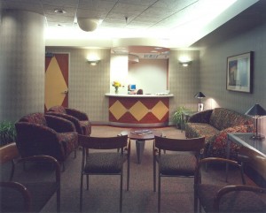
This reception room lobby area was constructed in the basement of the famous Esperson Building, off the tunnel system, located in downtown Houston, TX. A clinic for women, the project was a difficult design challenge. With an excellent location, exceptional style, the Esperson Building truly offered the best of everything to this discriminating downtown business. The building was originally developed in 1927 as a memorial to famed real estate and oil tycoon Niels Esperson. The property is a unique example of Italian Renaissance design. For this and numerous other reasons, this special design palate and furnishings reflected the buildings unique characteristics with a modern twist of style. The building is still one of Houston’s most historic and best-known landmarks, forming a distinctive feature on the city’s skyline. Throughout the spaces, the architecture and fixtures created an atmosphere of style and elegance. To the left of the picture, extremely large columns were incorporated into the design rather than hidden in walls. Additionally, the low ceilings required innovation too. The dome on the ceiling was painted white to opaque and cover a large shut-off valve that supported the entire buildings fire sprinkler water supply. High end ceiling tiles further added interest to the space.

Posted in HEALTHCARE PROJECTS | Leave a comment